My Portfolio - Course catalog
2021-2022
My Start
My first project at CorpU. A commercial-ready elearning experience. This project was to work a catalog into the existing application so that customers could better self-manage their courses via self-enrollment.
My goals:
- Create a browsable experience where administrators can publish courses and learners can self-enroll
- Give the administrators tools to better promote their courses and allow learners to filter based on their needs and interests
- Utilize accessible live search applications to have the most responsive catalog experience imaginable
- Give learners access to greater detail for courses without sacrificing the catalog browsability
- Allow site administrators complete control over the feature and sub-features with default configurations
- Result in a spacious visual design for flexibility and a low cognitive lift
- Create a space for partner affiliation and self-promotion
Data


Stage one - what can I put in this application? What is a paced, cohort learning course? What's inside of a course, how is it structured, and what's it made of? Cohort learning at CorpU was already extremely well-built, so understanding what data we could access and utilize helped tremendously.
We had a tight deadline that restricted us from being overly inventive. Thankfully we had the time to create a new tagging system for course builders to market their courses. I decided that the most critical piece of functionality should be an intelligent and live search function.
Administrative functions were viewed as completed after a design review with mockups.
Managing States
As I was the designer and developer for this project, I had decided with my team to build this application as a single-page application by inserting a react app into the page, seeding it with data, and creating an API endpoint to manage all filters. This allowed us to have live filters and include multiple views into one screen without having to reload the page.
One thing I didn't want was multiple pages for search and filtering. The idea of being able to copy a filtered URL to share it was tempting, but although this application strongly resembles an e-commerce experience, the goal was to help users find a course they needed. The goal was not for users to browse and convert users.
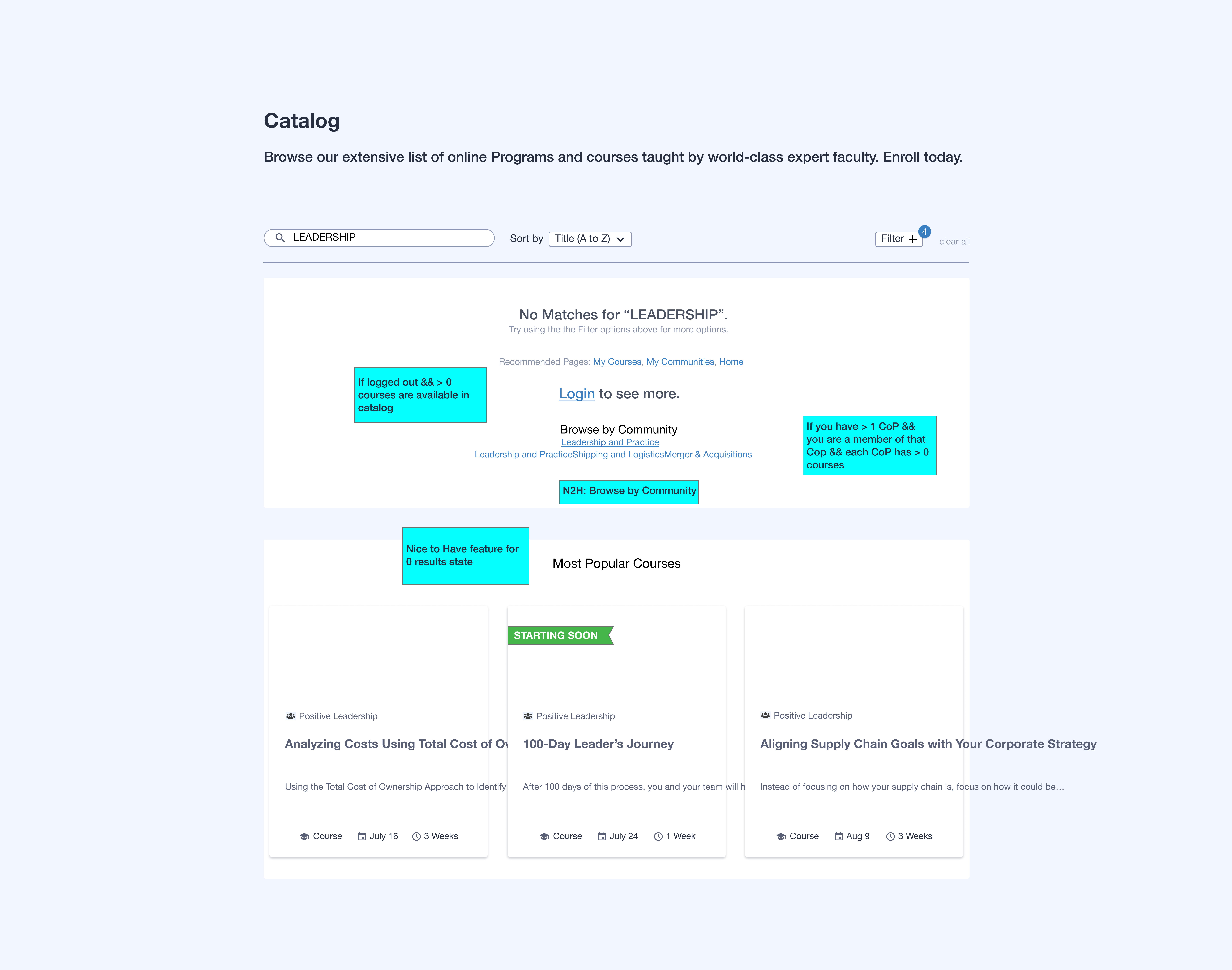
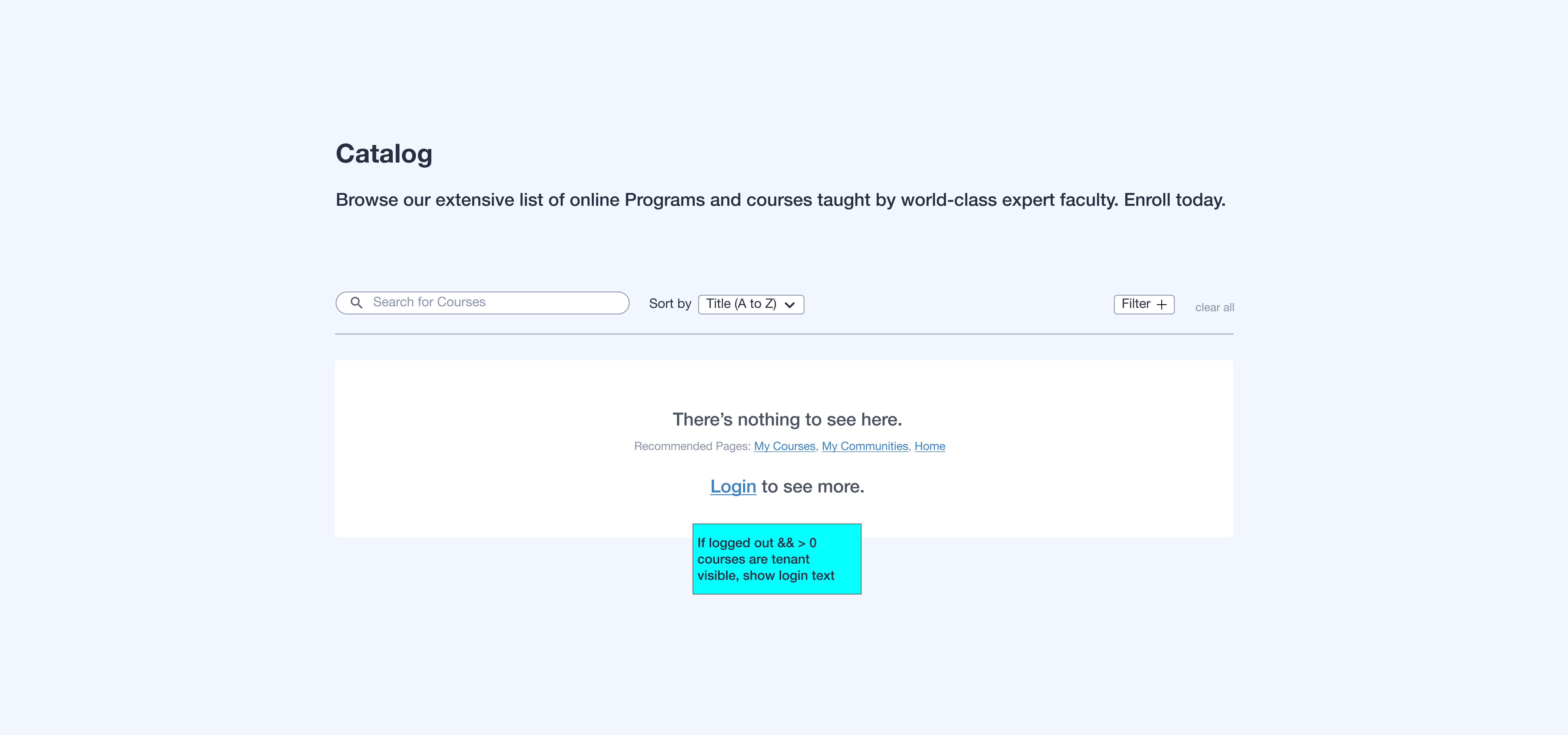
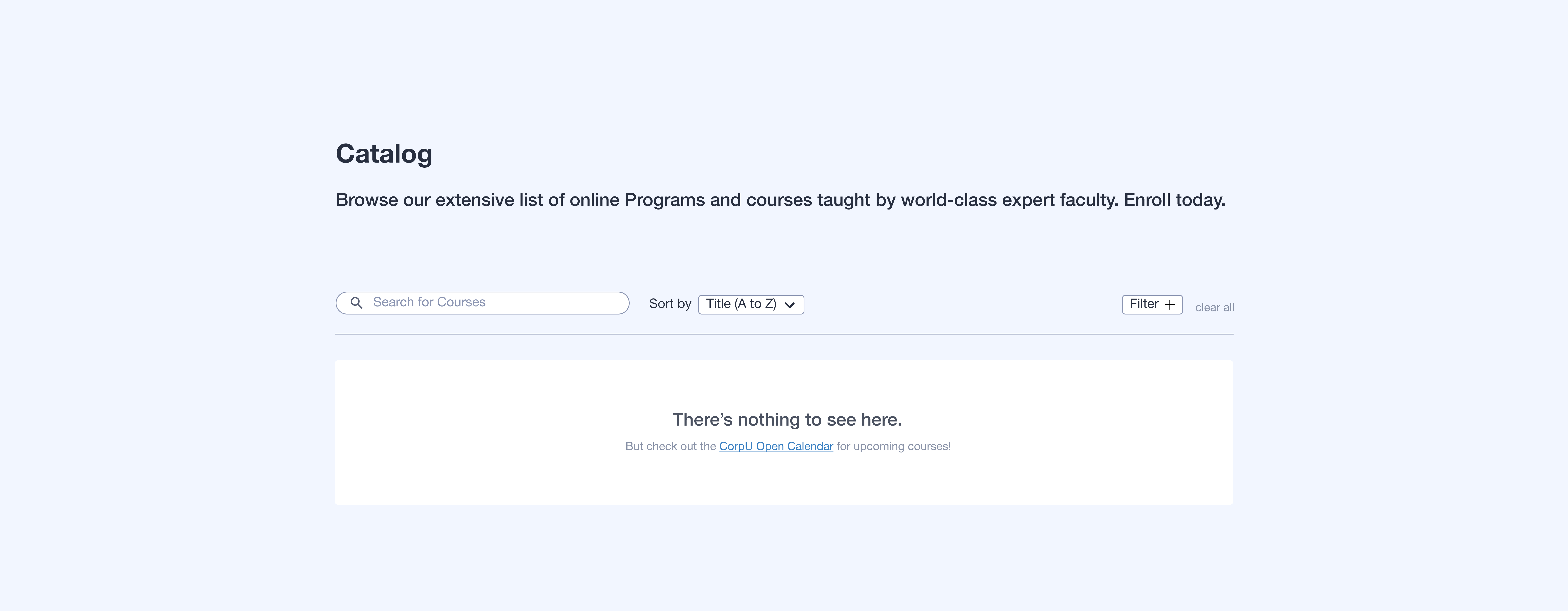
To this end, all states were managed in one app. The empty state, search results, no results found, etc. The focus of my design was to show the state of the user and the state of the application as clearly as possible. The spacious layout helped tremendously.


Development
 V3.png)
 V3.png)
This was my first time developing with react from nothing. My previous experience was in a helping role with a marketing agency. I helped iterate on their accessibility site scanning tool starting with performing a UX Review of their application. Once it was complete, they permitted me to make the changes myself.
Creating the react app and getting the data to the page happened after the page was initiated. We dumped the values we needed through the Django/python stack where I picked up what I needed to start the app.
The loading state appears while the promises wait for the API to return the data and load the cards and filter options. This way, we aren't loading anything we don't need, we have an immediate page load, and we can add URL parameters later if we want to pass in an initially filtered view.
The state management listened to both the filters and the live search I constructed. This way, as the users refine their search criteria, we could make a new request at each change and we could update the filter options to reflect how many courses reside within each criterion.
Wrap up
The application was launched for all legacy clients as disabled, and enabled by default for new clients. Within the first month, we saw adoption exceed our pre-launch customer sign-ups.
The app was noted as "extremely responsive", "quite cool", "easy-to-use", and "... so smart, it's like it knows what you're looking for every time"
Success!
Want more?
I invite you to check out my LinkedIn profile or view my web resume page.
If you have any questions, I welcome you to contact me via my Google form or via your preferred social network.
Recently added FAQ on my About page.
Recently added design process page.
Recently added certificates page.