My Portfolio - Accessibility and Modernization
2022
Check Out These Before and After Video Clips
No audio in videos.
Before
CorpU's High Impact Leadership Development Platform before compliance & responsive updates.
After
Now see how far I took it! Improved navigation, support information that follows across the platform, and WCAG 2.1 compliance!
My Start
"How long will it take to make the platform accessible?" - The question that began my largest project at CorpU/Udemy.
My Goals:
- Achieve WCAG 2.1 Accessibility Compliance for the learner experience
- Modernize the site with common web patterns
- Open the platform to a larger resolution for greater usability
- Increase the NPS (Net Promoter Score) by 10%
Complete Application Audit
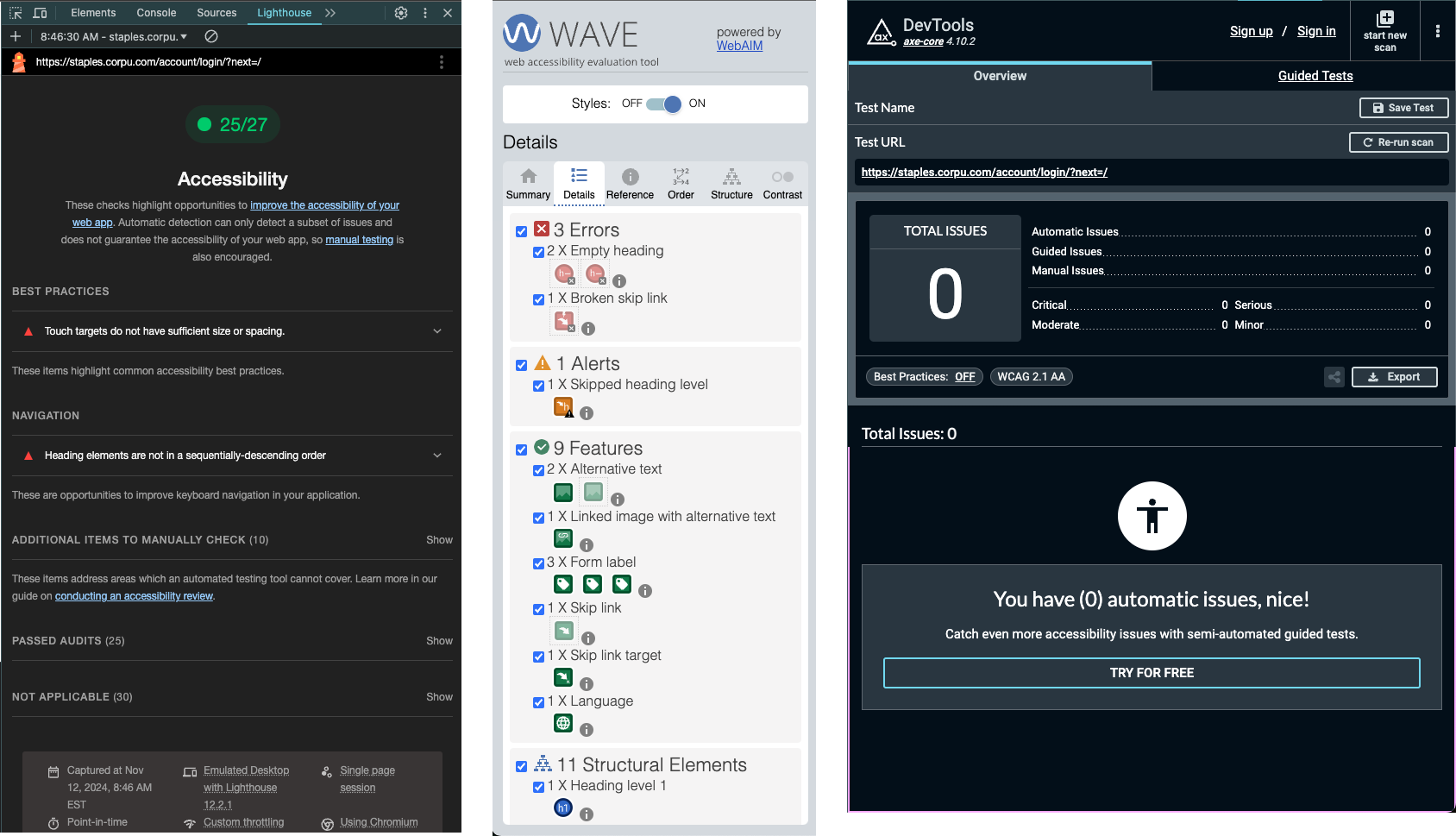
- Audit Tools:
- Wave, Lighthouse, and ax-core Plugin
The first stage of this large project involved gaining a thorough understanding of the application itself and uncovering any hidden accessibility issues. I initiated this project during my third month at CorpU.
To peel back the layers of the application, I conducted automated tests using the ax-core plugins and WAVE tool, supplemented with manual tests, to assess the overall accessibility score. This assessment became the foundation for my work plan.
I structured the work by prioritizing global updates first such as the navigation, footer, and reused components. Followed by the most common user pathways, and finally addressing more specific use cases.
The Rapid Redesign - Understanding
With compliance work well-defined, the next phase involved enhancing the full-page user experience.
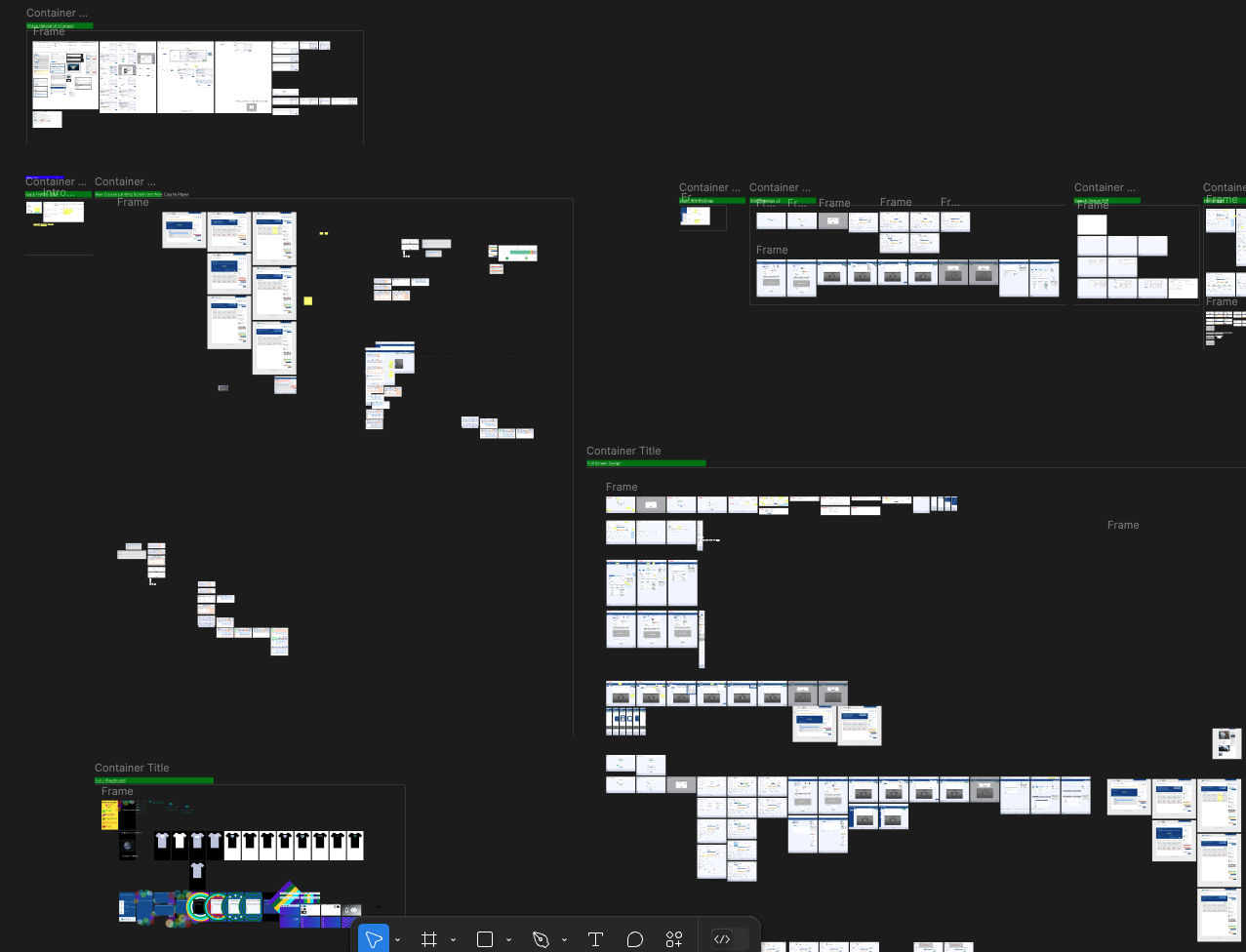
Wireframes
We started with quick, preliminary mockups to generate ideas and visualize potential improvements.
My goal was to open up the application for larger device usage without compromising readability or navigation. Using analytics, we identified the top 10 device screen sizes and used those to guide our redesign breakpoints.
Following this structured approach, I created mockups of a full-screen experience. Through testing, I discovered that most screens across user scenarios benefited more from a max width of 2560px than full screen, promoting readability and easy navigation.
Client Interviews
Following the rapid designs, we began internal team reviews and external client interviews.
I collaborated with our CEO and client team to create a comprehensive list of clients across our three primary business lines. From there, I worked with account team managers to identify key stakeholders and send out interview invitations.
Interview Results
What a difference the client insights made! This is why design reviews are so valuable. Screens and features previously thought obsolete turned out to be vital to two client categories, revealing a gap between client needs and our initial redesign metrics.
We made quick iterations and found time to tackle this new work.
The Rebranding Process
The final step in this project was a thorough audit, marking the beginning of our rebranding journey with Udemy. All automated scans showed 100% success, and our manual tests yielded positive results using the previously mentioned testing tools.
During this period, I juggled multiple design and development requests, including building a new global uploader and redesigning and building version 2 of the course catalog to incorporate newly added features.
Designing and developing simultaneously can mean deprioritizing certain tasks I would have liked to complete, such as additional market research, design reviews, and expanding my understanding of accessibility compliance.
After completing the updates, the rebranding process centered heavily on planning according to atomic design principles. We started by defining our colors, fonts, and other tokens, scheduling redesigns for items that didn’t align. By fitting more items into each sprint, I was able to bridge the gap toward our end goal of achieving a cohesive Udemy-branded experience.
As a result, we retained all clients who required an accessibility-compliant learning platform and successfully targeted new clients. Unfortunately, we did not see the anticipated increase in NPS to meet our usability goals. Based on feedback, the most likely cause was the trade-off between improved platform usability and the removal of certain customization features, resulting in a neutral effect on NPS. Nevertheless, the project achieved significant success by maintaining client retention and increasing profitability.
You can learn more about my time at CorpU / Udemy on my webpage, My Portfolio - CorpU & Udemy. You can see my slides in PDF format at my Corporate Presentations page.
Want more?
I invite you to check out my LinkedIn profile or view my web resume page.
If you have any questions, I welcome you to contact me via my Google form or via your preferred social network.
Recently added FAQ on my About page.
Recently added design process page.
Recently added certificates page.